| Logos FAQ | Full Color Banners | Corrugated Signs | Aluminum Signs | Fonts |
|
A company logo is your name, your "branding", your
image, so you want the best look possible, right? A logo will be seen
everywhere, from letterheads and envelopes to signs and advertisements. What
can make your logo stand out from the rest of the pack? The same thing that
can make or break your business, Concord Signs will work with you to design
the most professional, eye catching, yet eye pleasing logo at a price you
can afford, in the time you need it. Let Concord Signs take the added burden
of designing and laying out a logo off of your hands, so you can spend your
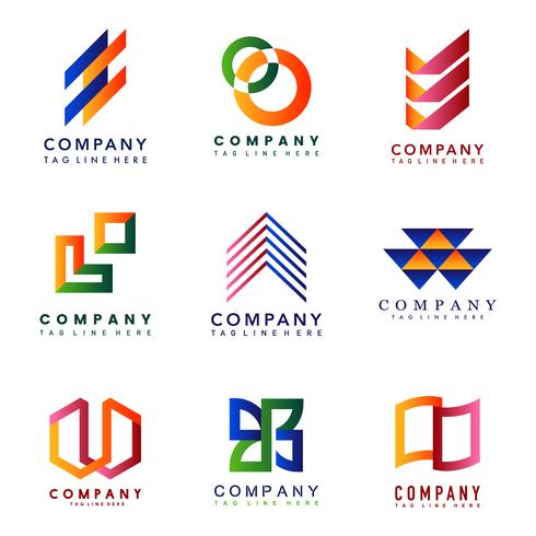
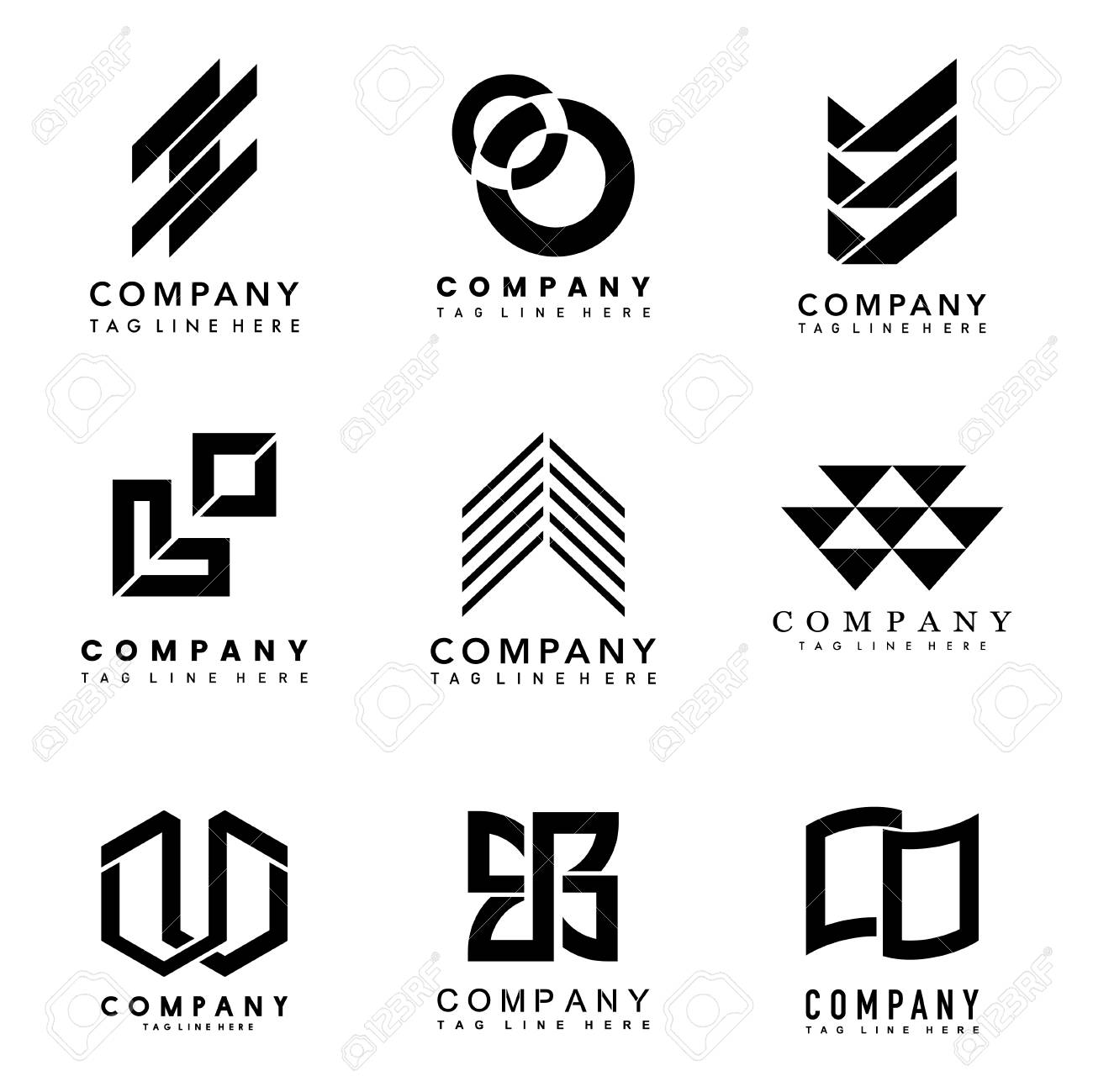
time where you need it most, on your business. Notice the difference in the
white/black and a color/gradient logo. A point to remember when choosing or
designing your logo: The black/ white can be easily shrunk down to fit on
letterheads, envelopes, or business cards. The color/gradient logo is a bad
choice for that type of logo, because when shrunk, the majority of the time,
the colors will blend, and words are hard to read. The color/gradient is
better for larger displays, such as signs, flyers, or advertisements. Full
color or Illustrated logos are totally different from either of the above
because, they are full color, can have practically any graphic illustration
or typeface, and can even look like they have actual depth and weight, like
the bottom logo.
|
|


