| Corrugated Signs | Magnetic Signs | Banners | Aluminum Signs | Fonts |
The Science
of Signs
|
||||||||||||||||||||||||||||||||||||||||||||||||||||||||||||||||||||||||||||||||||||||||||||||||||||||||||||||||||||||||||||||||||||||||||||||||
 |
||||||||||||||||||||||||||||||||||||||||||||||||||||||||||||||||||||||||||||||||||||||||||||||||||||||||||||||||||||||||||||||||||||||||||||||||
|
Now that we
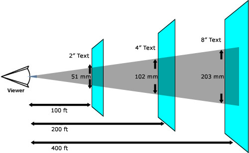
have a general rule for distance figured
out, a good sign must think about the
movement of the general traffic as they pass
by the sign. If your target audience is
walking or driving, the speed of their
movement will also factor into the design of
your sign. In order to factor this, we will
use some scientific research we have found,
which states that a moving audience will
need approximately three to four seconds to
process a message that contains six to eight
groupings of content that exists on your
banner. As a general rule for moving
traffic, your audience will need a minimum
of three seconds or less to process signs
that contain four inches of text, and if
your signs have too much content, your
reader will not have the time to comprehend
your message.
If your primary target is foot traffic whether indoor outdoor banners. If you audience is drivng in their cars, approximately 45mph or under you would want to use text that is at least 5 inches in height and you would want to keep your content grouping to a minimum. Outdoor signs where traffic is 60mph or slower would require 8 inch height text as your optimum size.
Content size, the flow of traffic, and even the environmental distractions including average weather conditions and your lighting will affect the readability of your signs, and taking all of these into consideration will make all the difference in how well your signs get the attention of your audience, and get them coming in to check you out. This article is merely an attempt to get you thinking in the right direction. They are also factors that we have taken into consideration in the many layouts we have created that you can modify to make your own. Making great signs is not a difficult task, but thinking your message through and looking at the conditions your sign will be placed in combined with the audience. |
||||||||||||||||||||||||||||||||||||||||||||||||||||||||||||||||||||||||||||||||||||||||||||||||||||||||||||||||||||||||||||||||||||||||||||||||